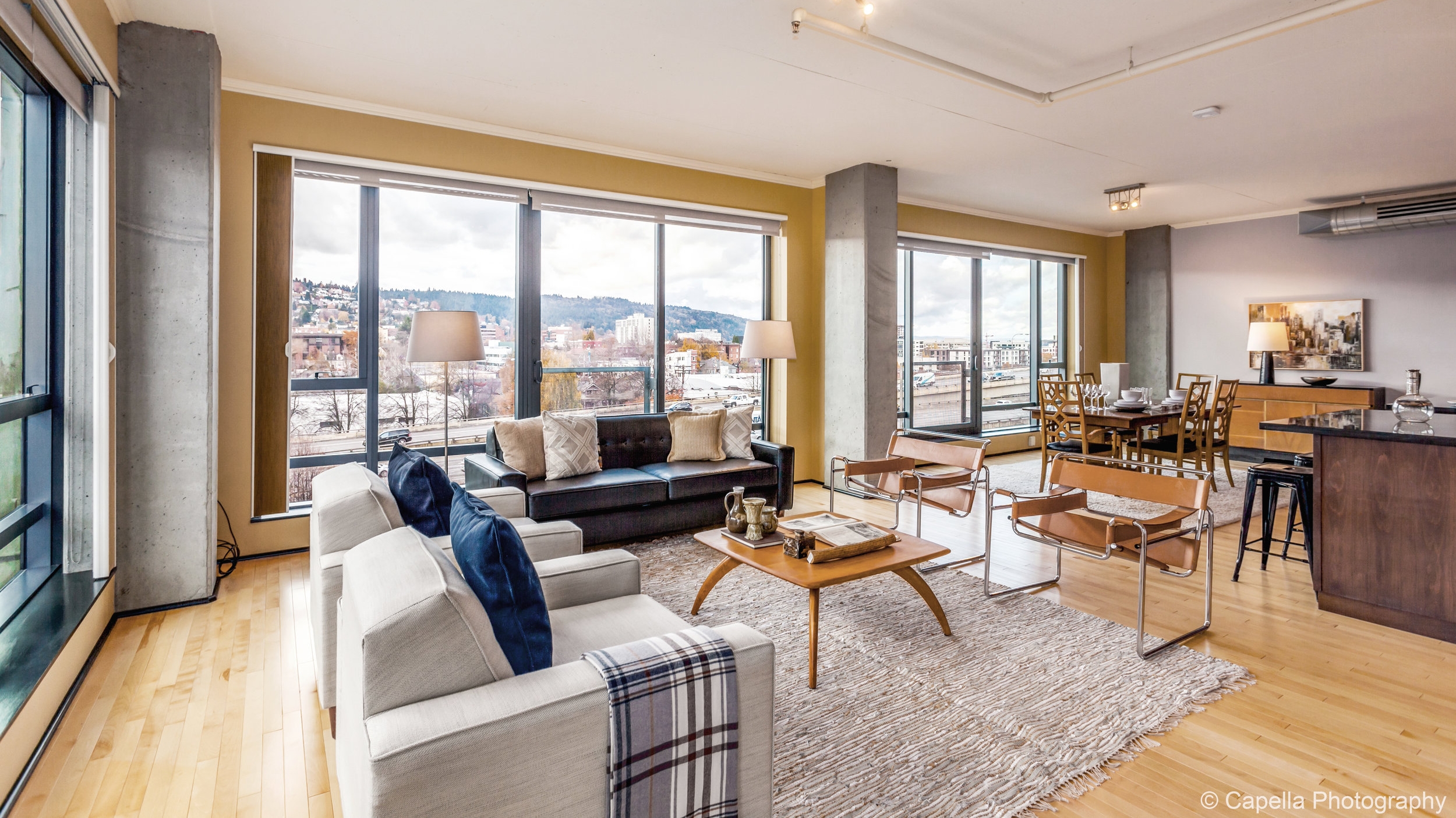
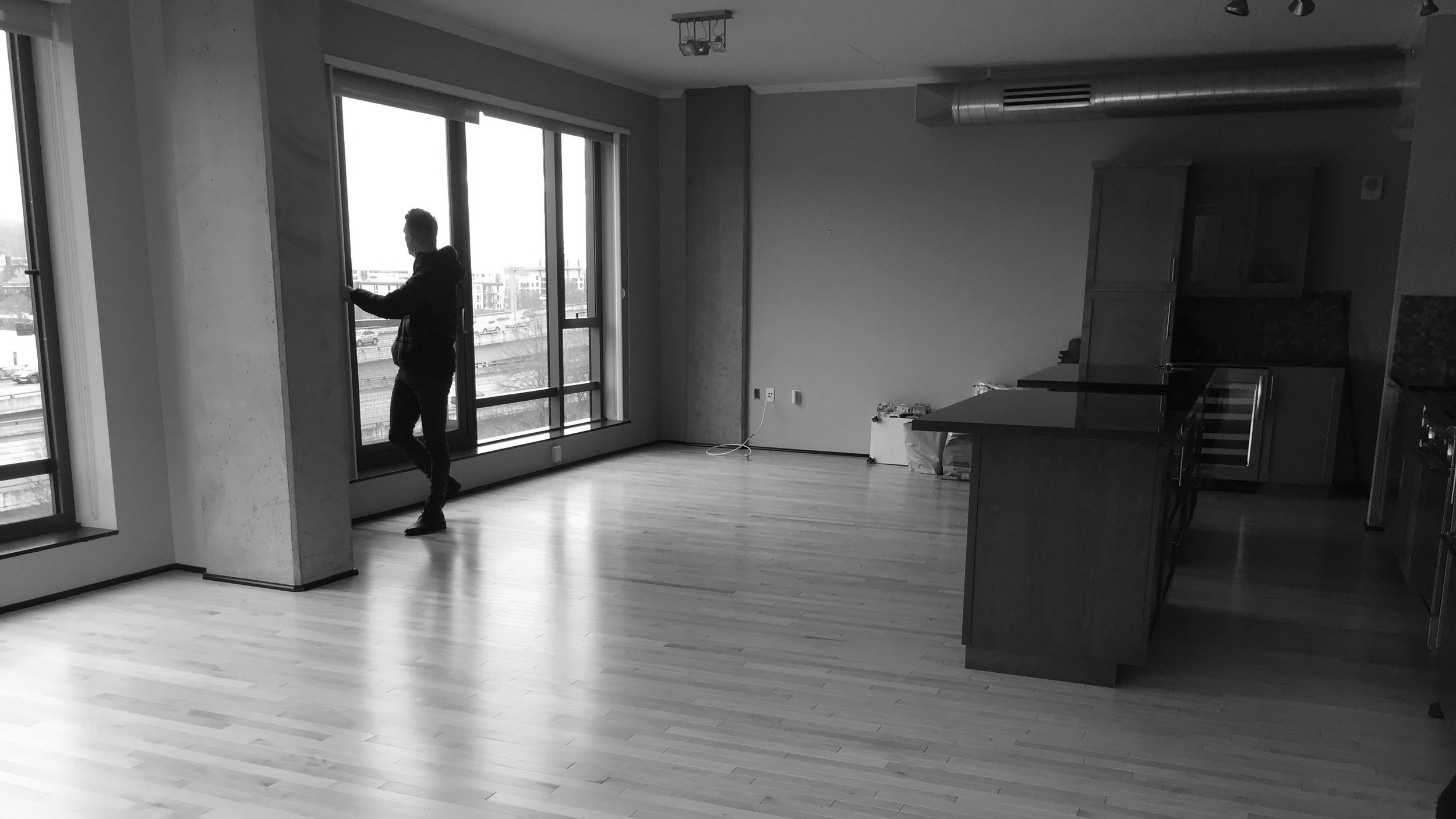
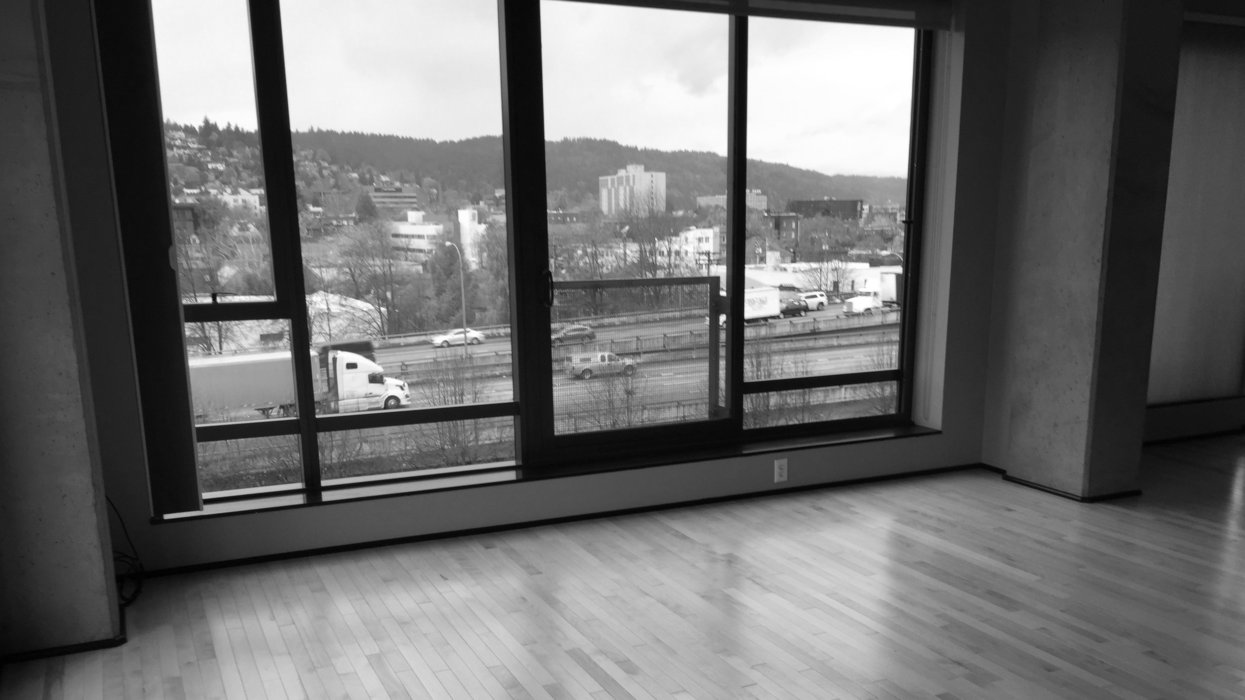
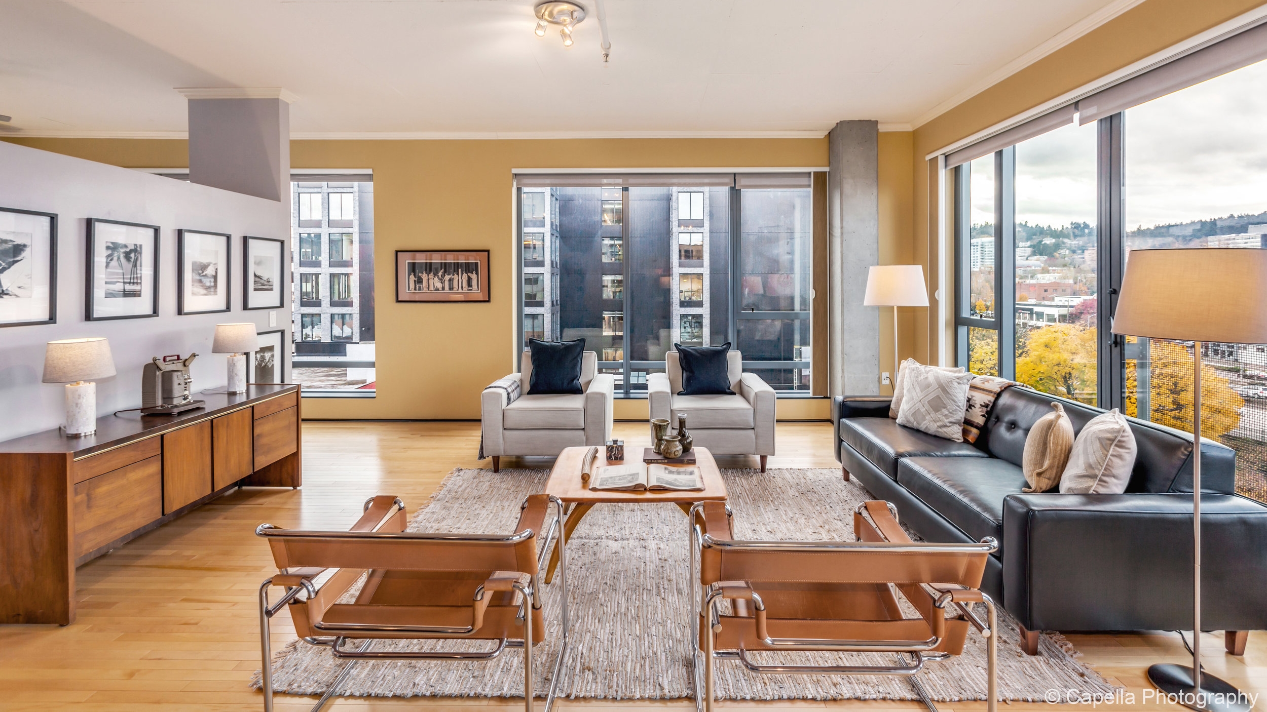
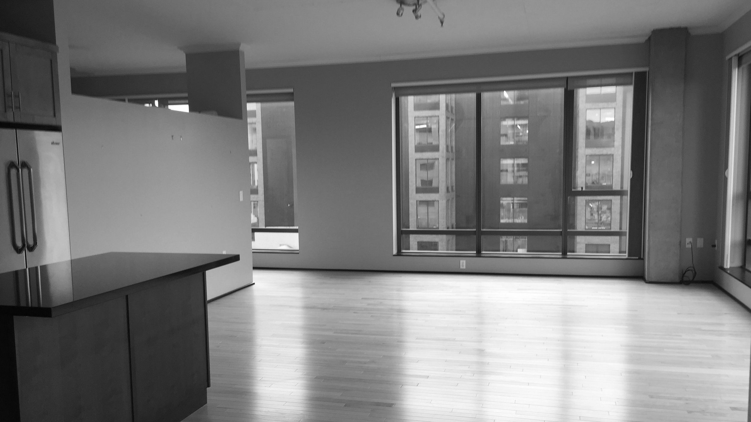
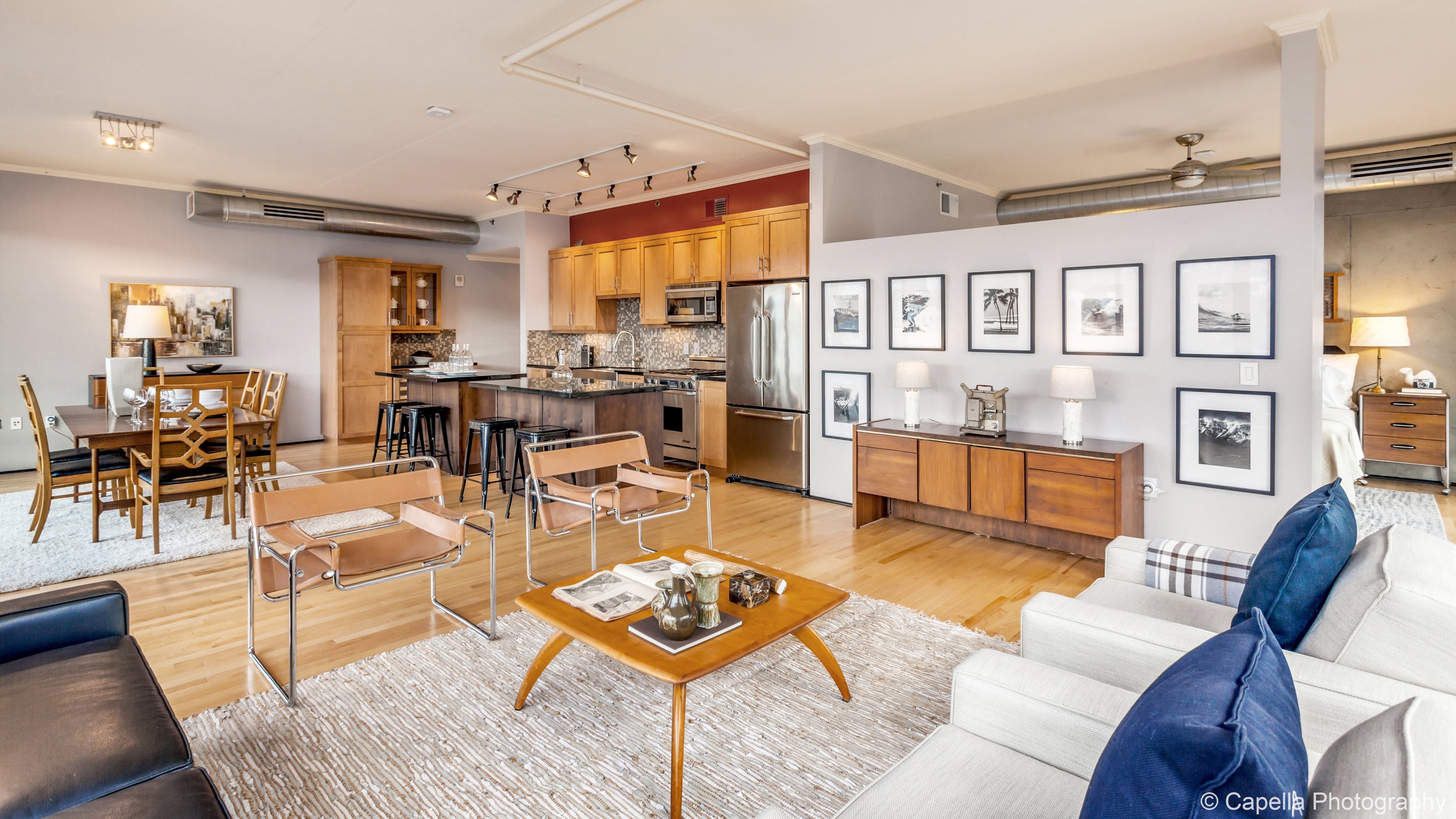
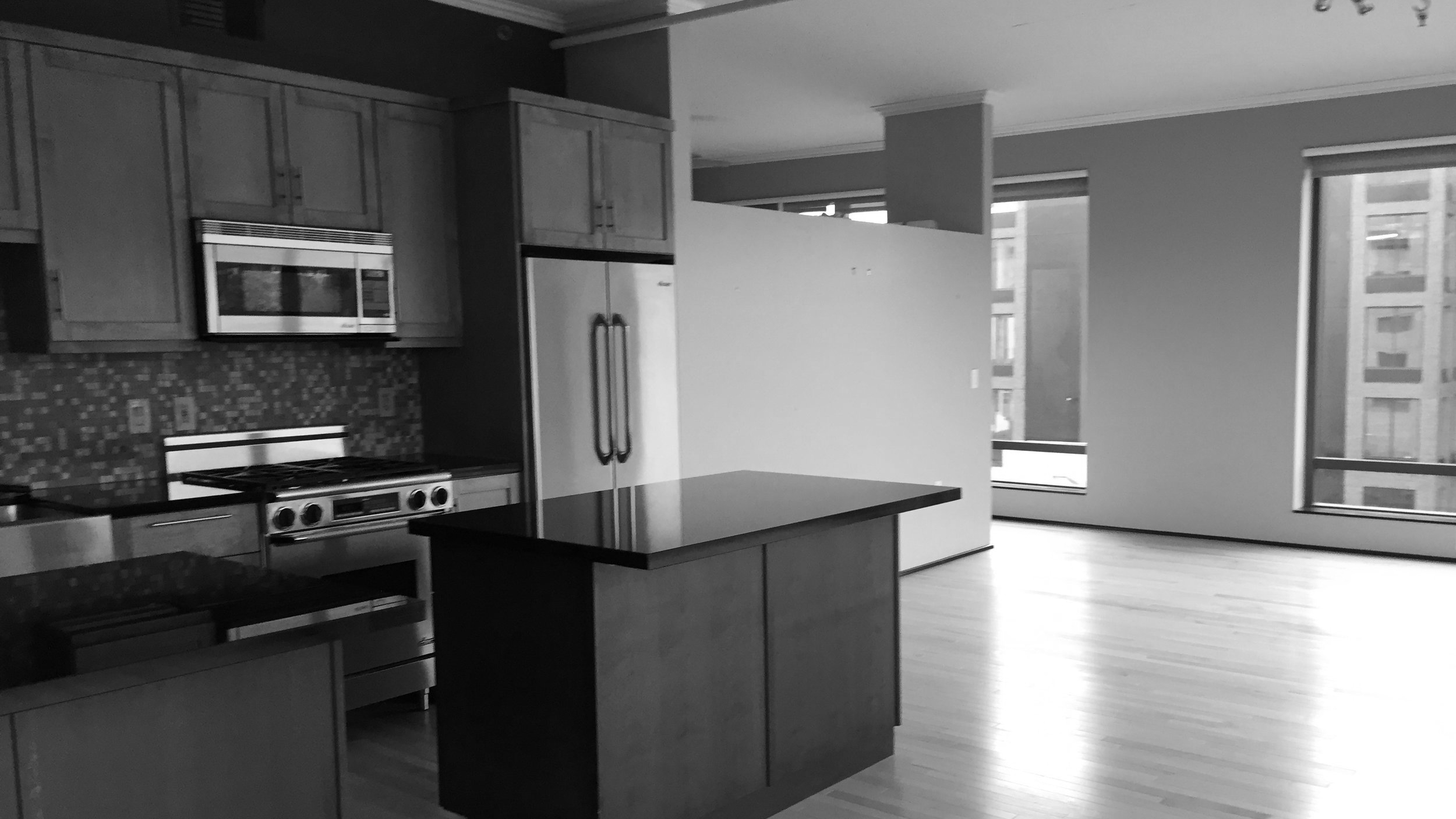
Every once in a while, it's good to review what a space looked like before it was staged. Often we feel like these spaces just fall effortlessly together. It takes days of planning and lots of man-hours to make these staged spaces look good. Slide the arrow to see before and after on this Portland, Oregon staging project.
The main living space in this studio apartment had three different paint colors to be taken into account when staging the space.
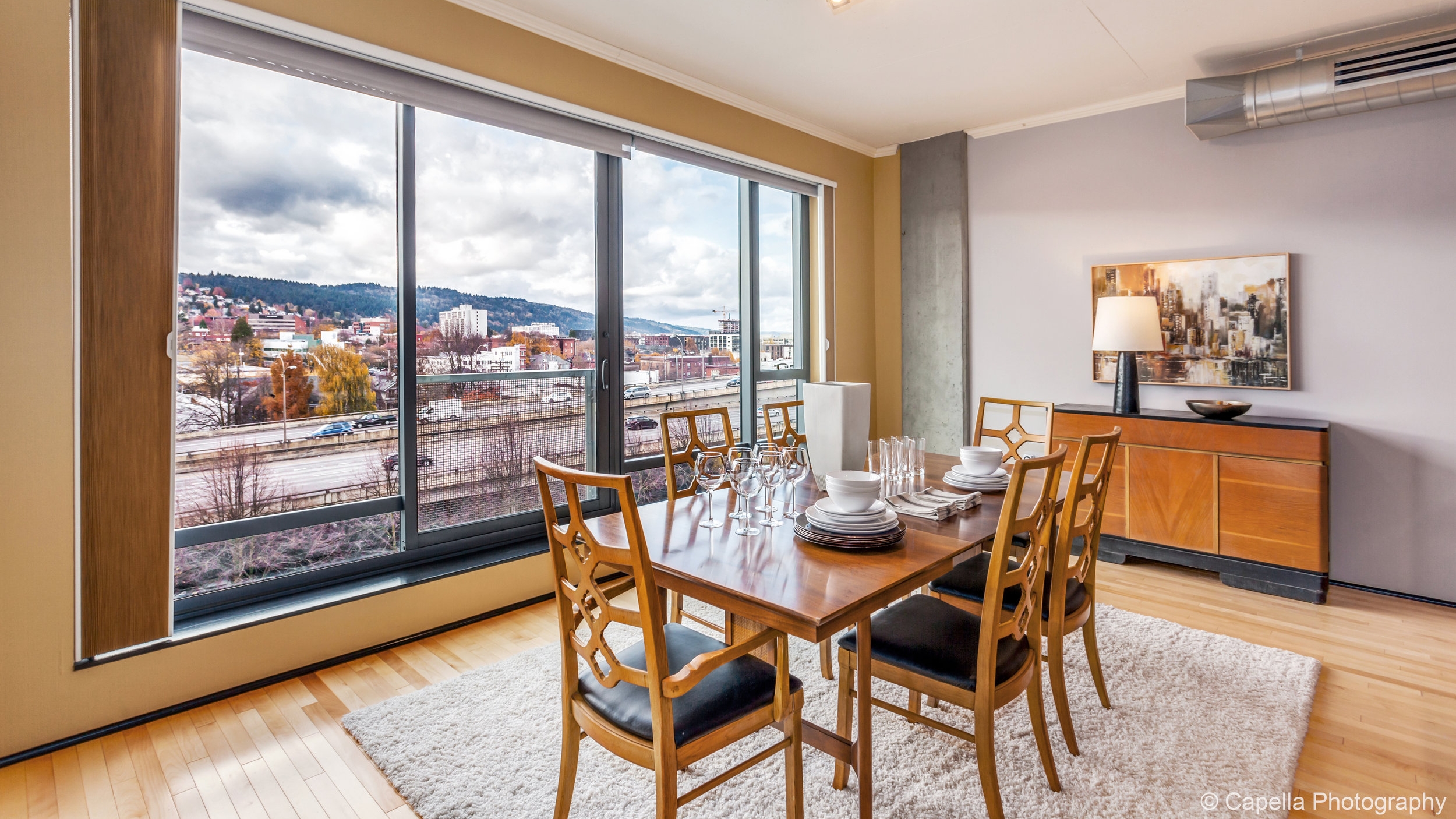
The staging took place in November of 2017. We wanted to highlight the lovely fall foliage and bring the outside in.
Because No. 726 had only one gathering space, marking the location of the TV was important. We never want to use "fakery" or "props" so we instead showed a media cabinet with a vintage projector on top it. Instead of trying to fool our buyer, we bring them in on the joke.
Space is at an absolute premium in homes like this. We staged this listing to evoke what it would be like to entertain in this space. We made sure the living room had seating for seven and the dining room had seating for 6 adults and 4 kids.
Staging often looks like the stager went to one store and bought an entire household of furniture. This comes across as hokey or fake. We staged this dining room with 1970's Chinoise chairs, a Danish mid-century modern table and an American art deco buffet. None of these items match, but all of them coordinate. Coordination is, of course, a much higher level of design than simply matching.
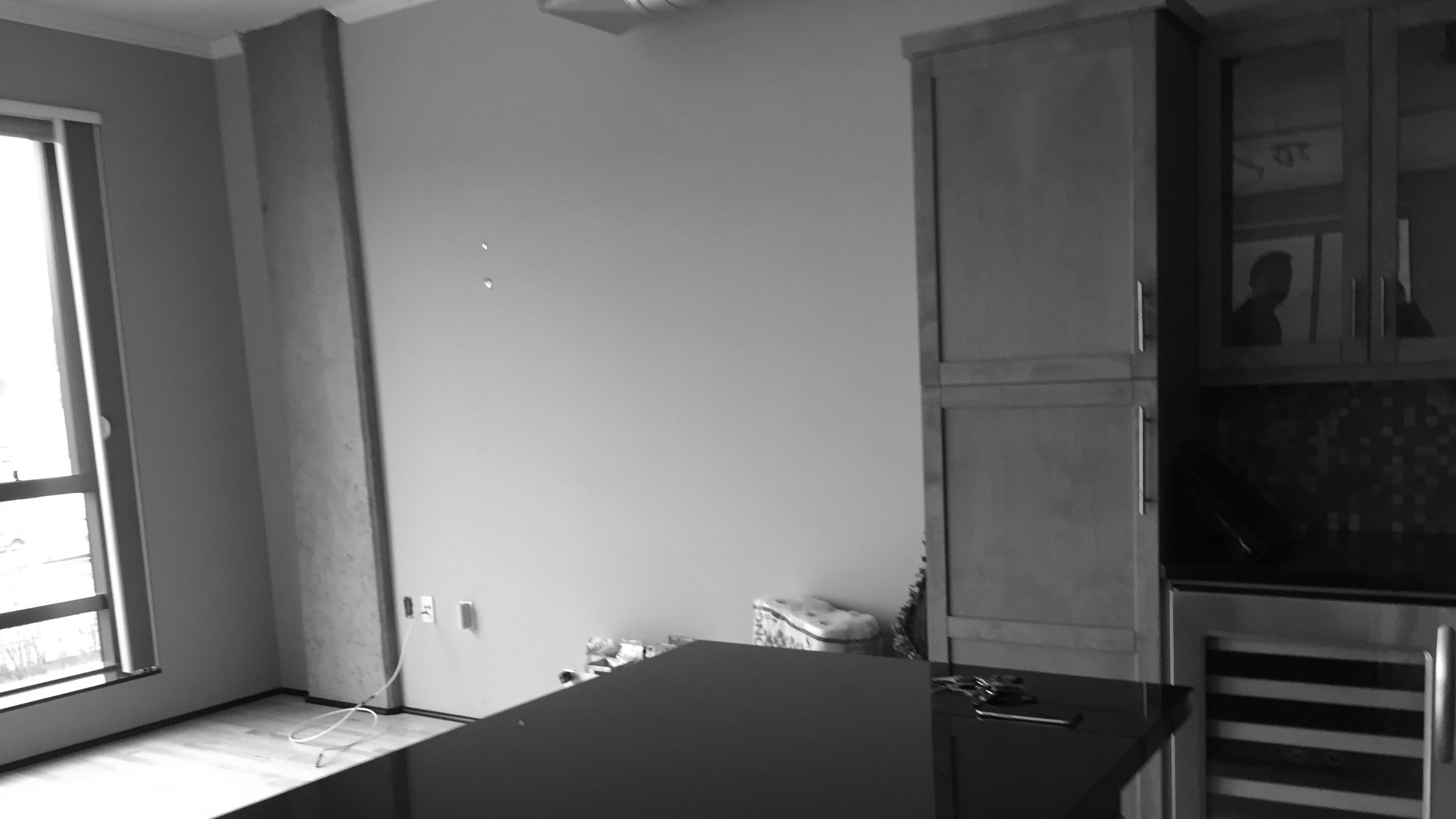
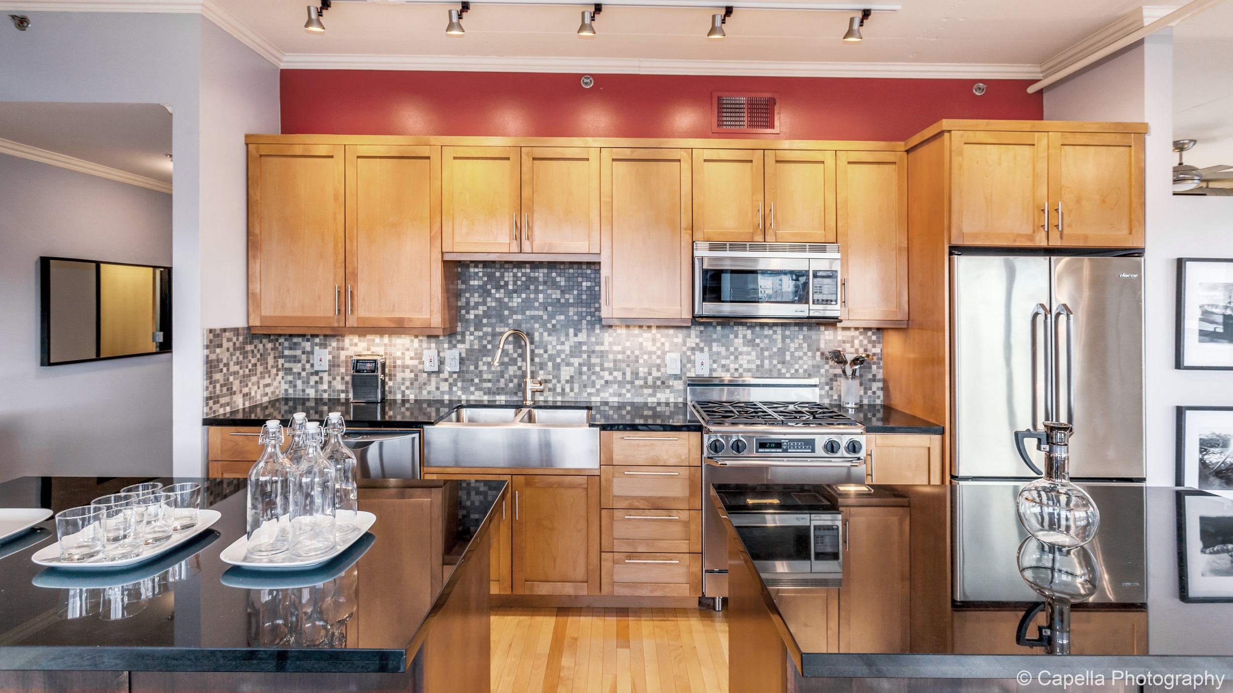
Kitchens can have a lot going on. This one had a red accent wall, multi color backsplash, and two islands. We kept the look as simple as possible. Note the vintage radio... our calling card.
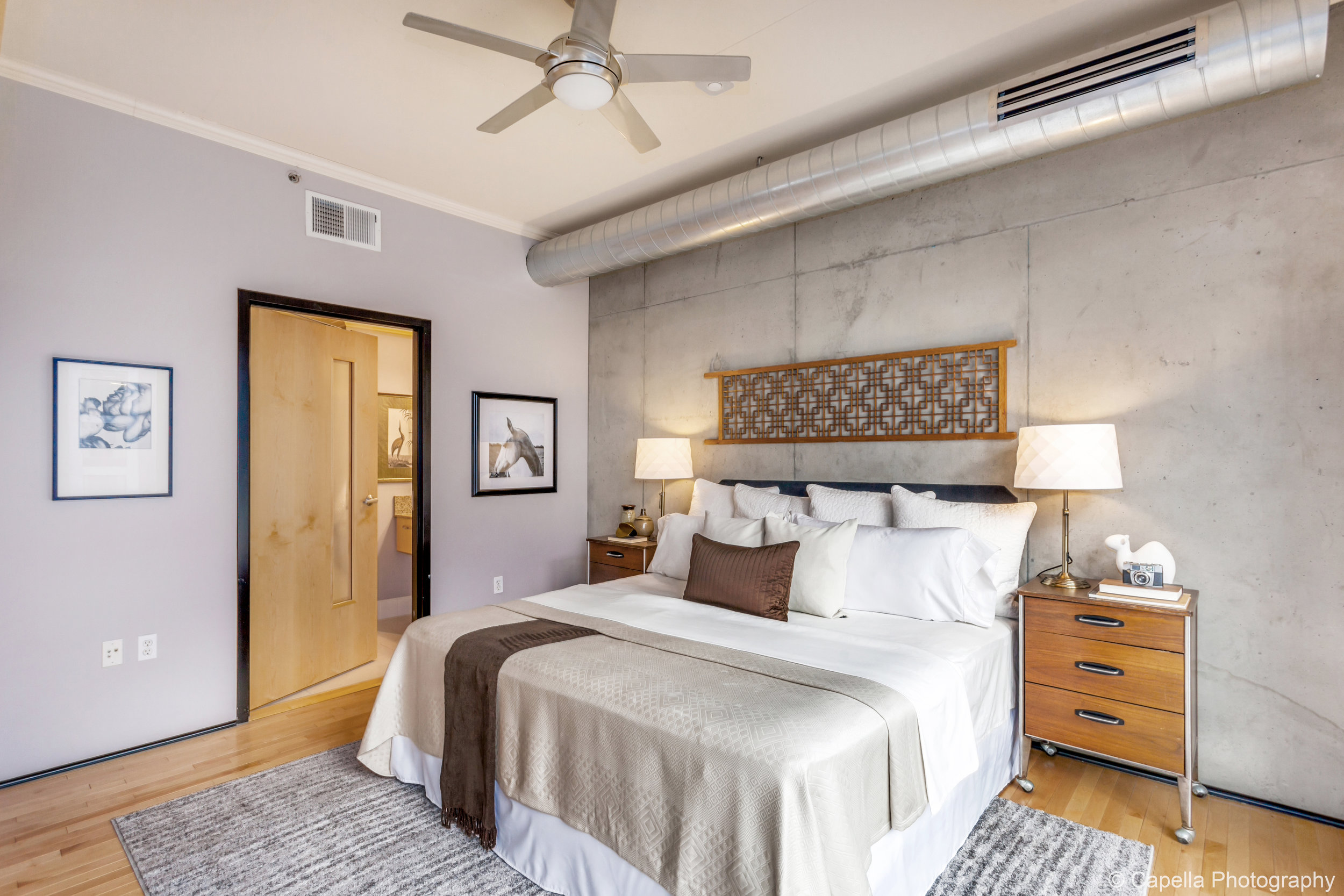
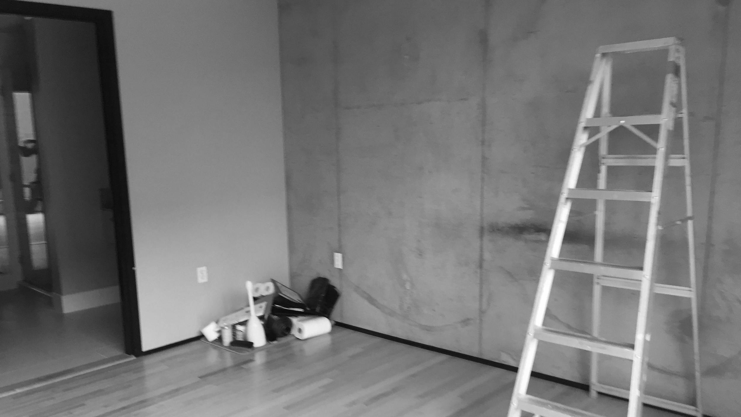
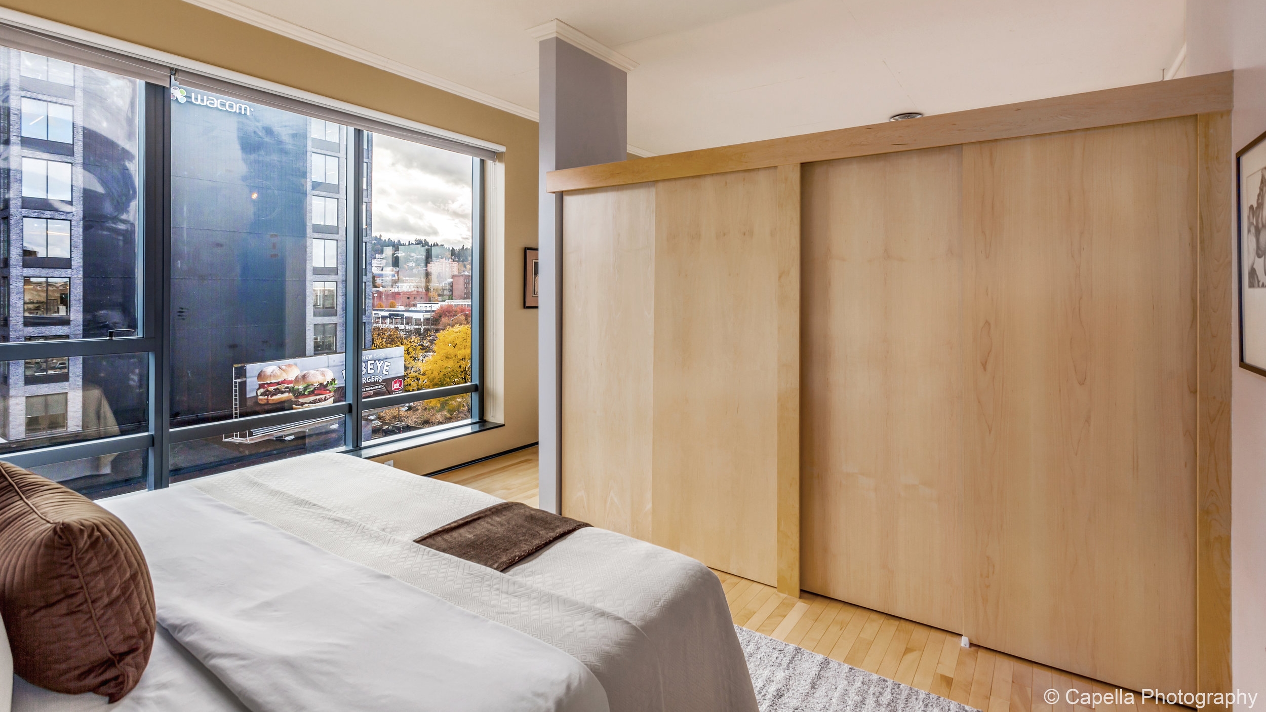
We often see blowup bed or beds that are too small in home staging. This room needed a king, it would stand for nothing less. Sure, king size mattresses and box springs are difficult to get in and out of trucks, hard to store and heavy to move up and down elevators and corridors. An appropriately scaled room will sell faster than a room that is poorly scaled.
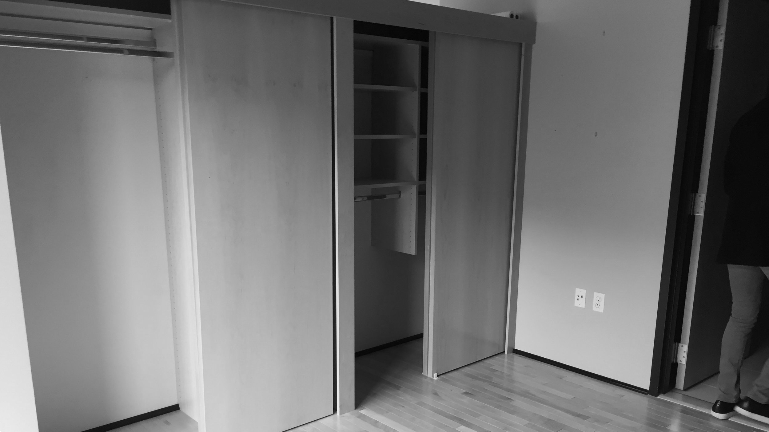
The first swing we took at this bedroom was mint green mixed with avocado green. The golden wall highly disagreed with the mint green. In order to keep the space calm we decided instead to show the room in all neutrals, thus making the space look easy to live in. The key point of aspirational - obtainable.
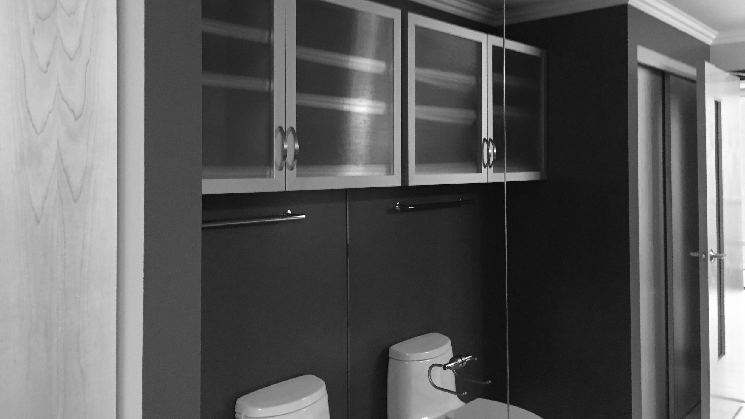
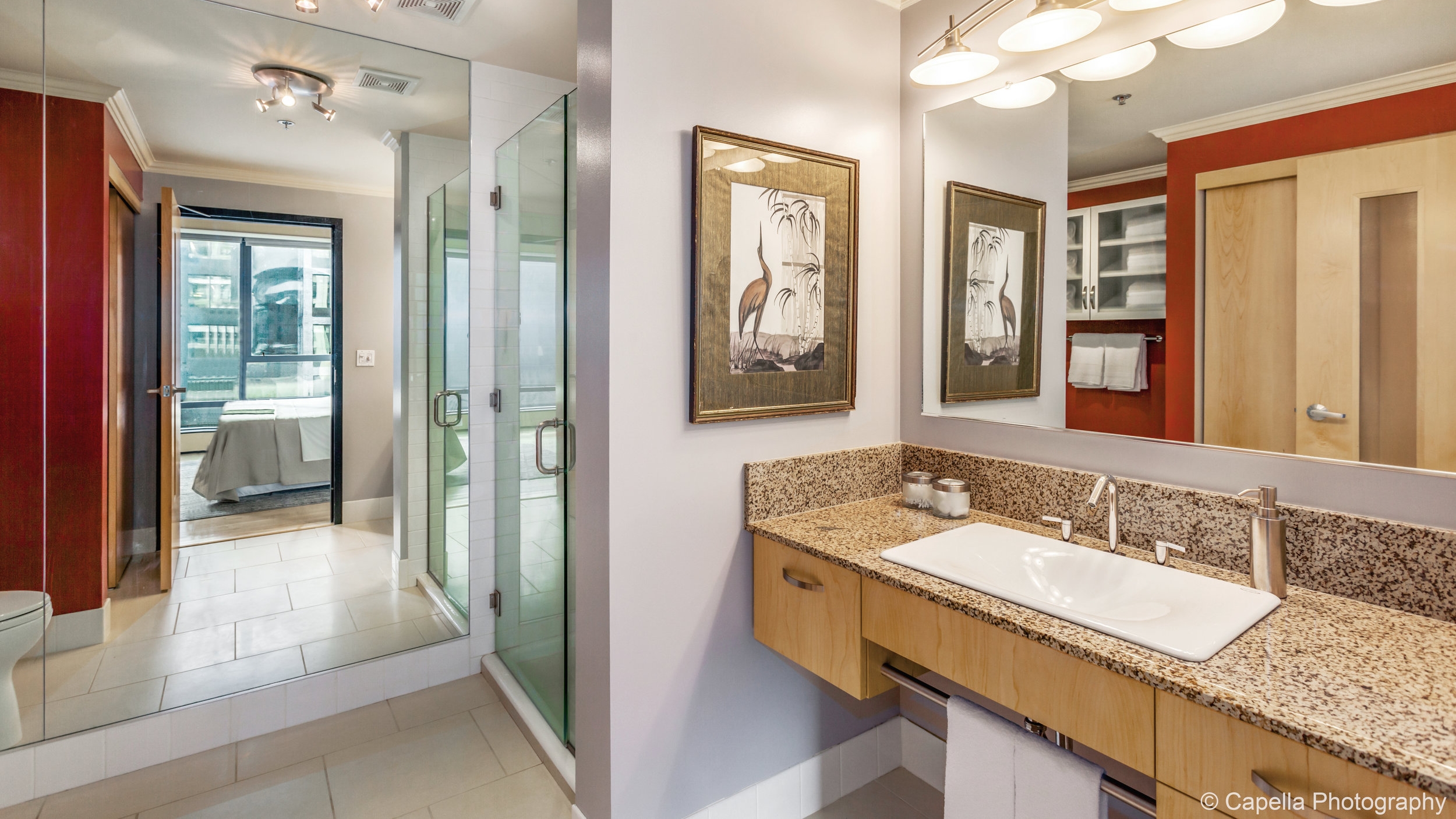
Again this bathroom has a lot going on in it. Our goal was to pull the granite countertop, as well as the grey and red walls together. We felt this piece of art did the job well.

